Once upon a time, Capcom was like “yo we’re gonna make this cool game for the Nintendo about a robot.” So they made the game, it was cool. They made music for it, that was cool. But when it came time to sell it, they forgot something…
…The cool box art.
Box Mega Man, here to look suspicious and wield a handgun!
This texture was made by Androu1 over a year ago. I don’t have the PCS and I’d be surprised if he does, either. But, that’s how things go… I wanted to bring this blast from 2008 to light.
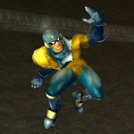
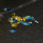
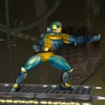
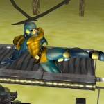
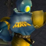
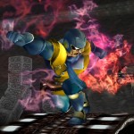
How we look back fondly at times long past and wish we’d just begun, no matter what those times were like…
he needs more bowleg
Didn’t Androu make this like, nearly a year ago?
Make the MM10 now and release it in 2012
Pfft. Mega Man is for kids. Samus Aran is where it’s at.
*shot*
“Wait, that’s who I was playing as, somebody kill it!”
Really, why did Capcom always make Megaman look retarded on the box art?
Because it was the ’80s
Wkid8, he also looks retarded in-game, so?
i thot the box art got changed only for the US?
(u know, like 90% of the time for all games since then)
It only looks like that in the American box art. The Japanese version is accurate to the in-game sprite.
I’m 99% sure I have the PCS for this